COMMUNICATION
Have you seen the amazing video of Hans Rosling (R.I.P.) narrating the history of human population growth over the past 200 years? It's the one where he looks like he is physically grappling with his data. If you said "yes", you'll appreciate what I'm up to here. If you said "no", do yourself a favor and check it out (click on the Gapminder photo below).
More science isn't always the solution to our problems. At times, the quest for greater scientific certainty may even be counterproductive. Hans Rosling understood this. He tried to make data on human health and world population growth fun and accessible to everybody. Just spend 10 or 20 minutes at his Gapminder website and you'll see exactly what I mean. Sometimes, we can do a lot with the information we already have - we just need to be more creative in how we use it.
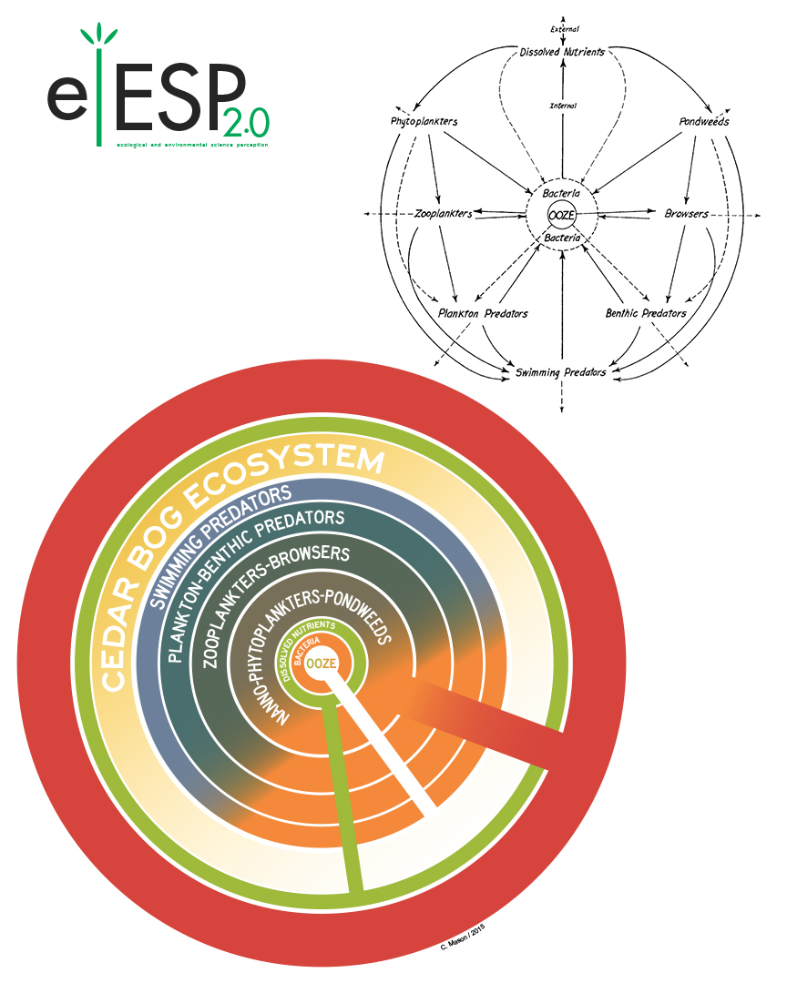
I believe there is an important lesson for ecologists and environmental scientists here, and I'm working hard to make my case. About 10 years ago, I teamed up with some intrepid faculty from the VCU School of the Arts (one of the best art schools in the country) to begin an interdisciplinary experiment in broad science communication training. We dubbed this effort Ecological and Environmental Science Perception version 2.0 (eESP2.0).
The bread-and-butter of eESP2.0 is the ‘Infographics’ graduate class. This is a crash course on graphic design, where students learn the basics of typography, color theory, etc. We spend a lot of time working on vector graphics, using Adobe Illustrator or InkScape software, and progress through four benchmark assignments: a typographic composition, a set of graphical icons, a complete infographic poster, and a personal logo. The poster below is a good example of what the students learn to do. This example was created by former student Taylor Woods. If you’d like to know more, you can read all about eESP2.0 at Scientia.